Collections and filters
Every collection page uses the Collection section: a banner, the filters, and a grid of product cards with a “Load more” button under it. The filters come from Shopify. The theme decides where they show and how they look.
Set up the collection page
Section titled “Set up the collection page”Open the theme editor, choose a collection page from the page menu at the top, and select the Collection section.
- Banner picks the top of the page. Text only shows the title, the product count and the collection description. Photo puts the title over the collection’s image. Boards over photo cuts the collection’s image into upright boards, one per product. Past 60 products, each board stands for a group, and a line says how many. A collection with no image shows no photo in either photo banner, so set one in Shopify first.
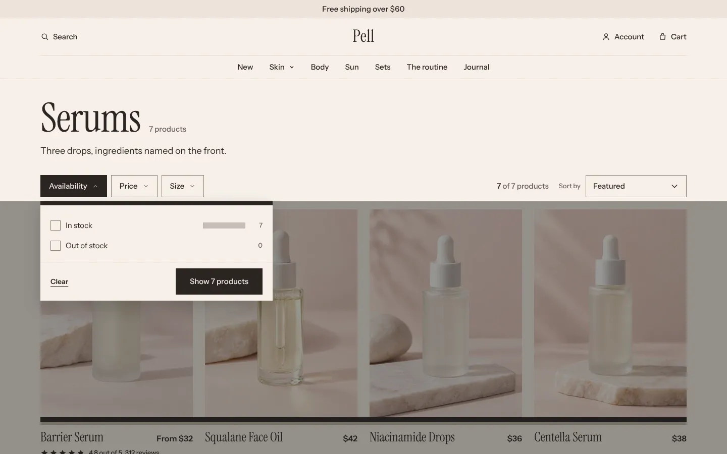
- Filter layout places the filters: Sidebar in a column on the left, Drawer behind a “Filter and sort” button that opens a panel from the left, and Top bar as a row of buttons above the grid, each opening one filter.
- Columns on desktop sets 2 to 4 products per row.
- Products per page sets how many cards load at once, from 8 to 48. The default is 24.
The presets set these differently. Tambour uses Boards over photo with Sidebar, Mercer uses Drawer with 4 columns, and Linden uses Top bar with 4 columns.
On screens narrower than 750px, every layout shows the “Filter and sort” button, which opens the filters and the sort menu in one full-screen panel.
Add filters in Search & Discovery
Section titled “Add filters in Search & Discovery”Tambour shows the filters you set up in Shopify’s Search & Discovery app, such as availability, price, color or size. The theme has no filter settings of its own. Shopify explains how to add and order filters.
Each filter is a group that opens and closes under its heading. Its values are checkboxes with the number of matching products beside them, and a bar that shows that number against the largest value in the group. A filter set to show swatches in Search & Discovery fills each bar with the value’s color.
A group shows its first 6 values and hides the rest behind “Show 3 more”. A size filter with up to 8 values shows them as a row of boards instead: one named Size, or one whose values are all letter sizes, such as S, M and XL, or all numbers.
Ticking a value updates the products at once, without reloading the page. Each active filter shows as a chip above the grid, with “Clear all” after the chips.
How shoppers use the price rail
Section titled “How shoppers use the price rail”The price filter is a rail with two handles, from 0 on the left to the highest price in the collection on the right. A shopper drags either handle, or types an amount into the From and To fields under the rail, and the products update when they let go of the handle or leave the field. A handle left at the end of the rail doesn’t filter that end, so “From” left at 0 means no lowest price.
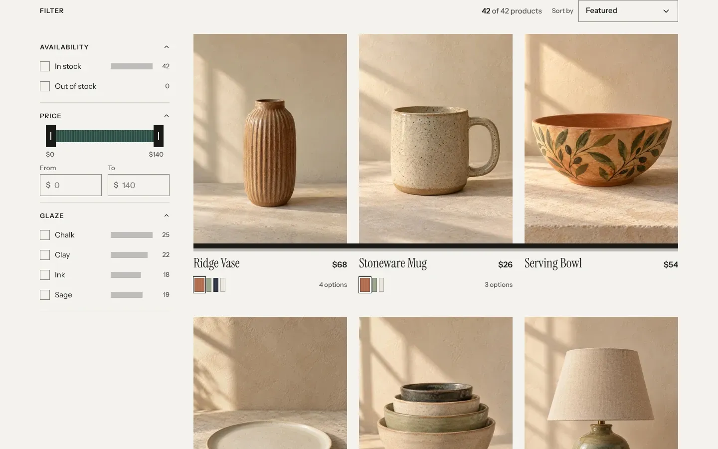
The price filter only shows when it is turned on in Search & Discovery. On a collection that fits on one page, it is also left out when every product costs the same, because there is nothing to choose.
Sorting and product counts
Section titled “Sorting and product counts”The “Sort by” menu holds Shopify’s sort options, such as Featured, Best selling and price. You can’t add or rename them in the theme. Each collection opens in the sort order you choose for it in your Shopify admin. Shopify explains collection sort order.
The page counts products in three places:
- The banner shows the collection’s total, such as “42 products”. The word after the number comes from Count word and Count word for one in Theme settings > Spines.
- The toolbar shows how many products the filters leave, as “18 of 42 products”.
- Under the grid, “Showing 24 of 42” sits beside a row of slats that fill as more products load. “Load more” adds the next page below without leaving the page.
The All collections page
Section titled “The All collections page”The All collections page, at your store’s /collections address, uses the All collections section. It shows every collection as an upright spine with its image, title, product count and the start of its description. The more products a collection has, the taller its spine.
- Sort shows Most products first, the default, or A to Z.
- Per row on desktop sets 3 to 5 spines per row.
The page shows 48 collections at a time, with page links under them. Each collection keeps the same spine color in both sort orders, picked by its size among your collections.
Common questions
Section titled “Common questions”Why don’t I see any filters?
Section titled “Why don’t I see any filters?”The collection has no filters in Search & Discovery, or the app isn’t installed. Without filters, the sidebar shows only the “Filter” heading, and the drawer and top bar layouts show no filter button.
Why does the price rail start at 0?
Section titled “Why does the price rail start at 0?”Shopify gives the theme the highest price in a collection but not the lowest, so the rail always starts at 0.
Can I show more than 48 products on a page?
Section titled “Can I show more than 48 products on a page?”No. Products per page goes up to 48. Shoppers see the rest with “Load more”.
Why does Boards over photo show only the title?
Section titled “Why does Boards over photo show only the title?”The boards need a collection image and at least one product. Set the image on the collection in your Shopify admin, and add products.