Product pages
A Tambour product page is the Product section, with the Pairs well and Recently viewed sections under it. The photos stand on the left and the buy box on the right. To edit it, open Online Store > Themes > Customize and choose Products > Default product from the page menu at the top.
Choose a gallery layout
Section titled “Choose a gallery layout”Select the Product section and pick a Gallery layout:
- Slat gallery, the default, shows the chosen photo wide and the other photos as narrow slats beside it. A shopper clicks a slat to bring that photo forward.
- Stacked puts every photo full width down the page, with a column of numbered markers beside them that follows the one in view. On a phone the photos become one row to swipe.
- Thumbnail rail shows one large photo over a row of small ones.
- Large photo with carousel shows one large photo with Previous and Next arrows and position markers under it.
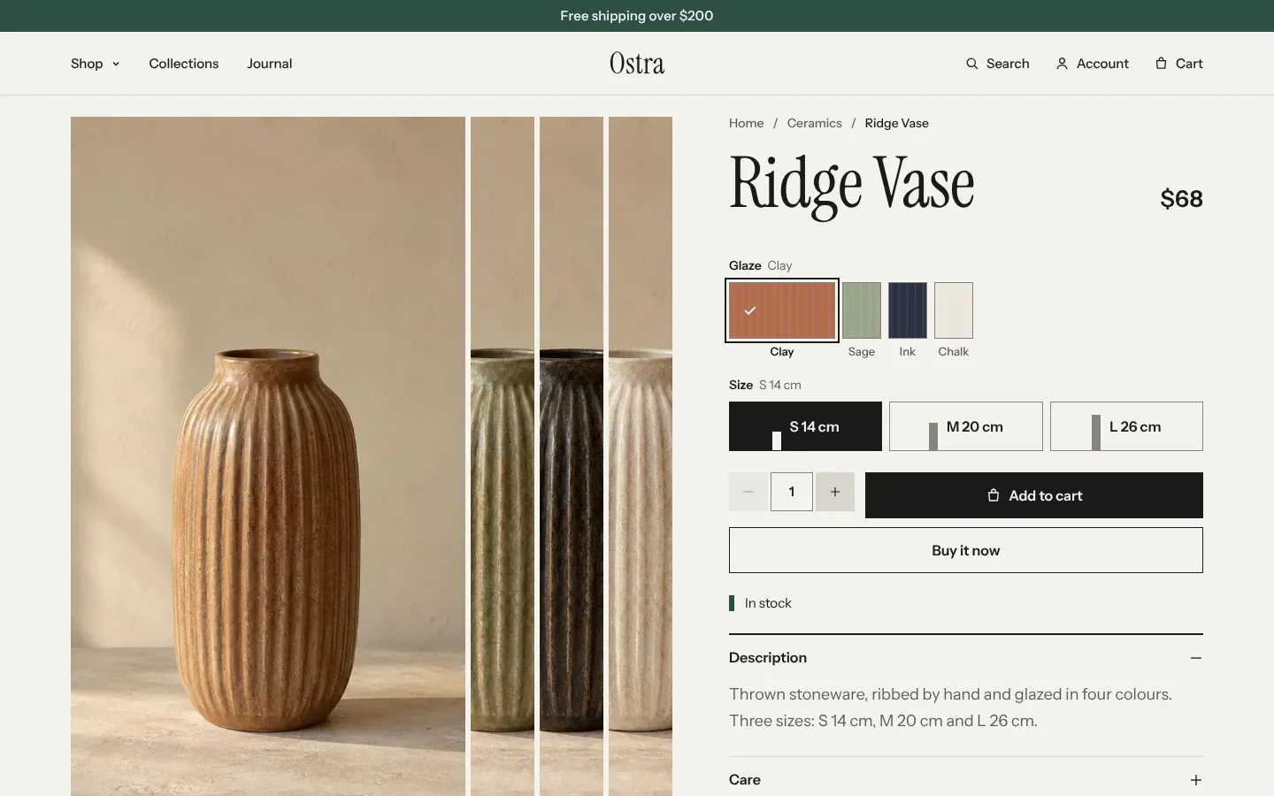
In every layout, clicking the large photo opens a full-screen viewer, and in Stacked any photo does. Videos and 3D models from the product’s media play in place. When a shopper picks a variant that has its own image, the gallery starts at that image.
Keep buy box in view is on by default. On screens 990px and wider, the buy box stays on screen while the photos scroll past it. On phones and tablets the buy box scrolls with the page. Once its “Add to cart” button has scrolled off the top, a bar with the product name, price and its own “Add to cart” button rises from the bottom of the screen. That bar doesn’t depend on this setting; it needs a Buy buttons block in the section.
Arrange the buy box
Section titled “Arrange the buy box”The buy box is made of blocks. Photos is the only one you can’t remove or move, because it is the gallery. Every other block can be removed, reordered, or added again with Add block:
- Product title and Price. The price shows the compare-at price struck through when the variant is on sale, the unit price when the variant has one, and Shopify’s Shop Pay Installments line when your store offers it.
- Description prints the product description. The Tambour preset leaves it out and shows the description as the first row of Details instead. Mercer and Linden use the block.
- Variant picker shows one group of buttons per option. Products without options don’t show it.
- Quantity selector and Buy buttons. Buy buttons holds “Add to cart” and Shopify’s “Buy it now” button. When the variant is sold out, the button reads “Sold out” and “Buy it now” is hidden.
- Size guide, Purchase options, Pickup availability and Details, each covered below.
- Custom Liquid for your own code, and blocks from installed apps.
After the blocks, above Details, the section prints a stock line: “In stock”, or “Only 2 left” when Shopify tracks the variant’s inventory and 3 or fewer are left.
Set up color swatches
Section titled “Set up color swatches”The variant picker shows a swatch for every option value that has a swatch in Shopify, and a plain button for the rest. You don’t upload swatches to the theme. Shopify gives option values a color or an image when you link the option to a category metafield, such as Color, on the product in your admin. Shopify’s guide to using category metafields walks through it.
Options whose every value has a number and a unit, such as “S 14 cm”, “30 ml” or “250 g”, show a small board on each button, as tall as its number compared with the largest. The theme reads ml, l, g, kg, mm, cm, m, in and oz.
Add a size guide
Section titled “Add a size guide”The Size guide block adds a fit line under the variant picker and a “Size guide” button that opens a drawer. The drawer shows each size as a board as tall as its chest measurement, a table of the measurements, and a switch between centimeters and inches.
- Select the Product section and click Add block > Size guide.
- In Size option name, type the name of the option the guide is for, as the product spells it. The default is “Size”.
- Click Add block inside the Size guide block and choose Size.
- Set Size name to one value of that option, exactly as the value is written, such as “M”. Set Chest. Waist (cm) and Hip (cm) are optional; their column shows when at least one size has them.
- Repeat for each size, then click Save.
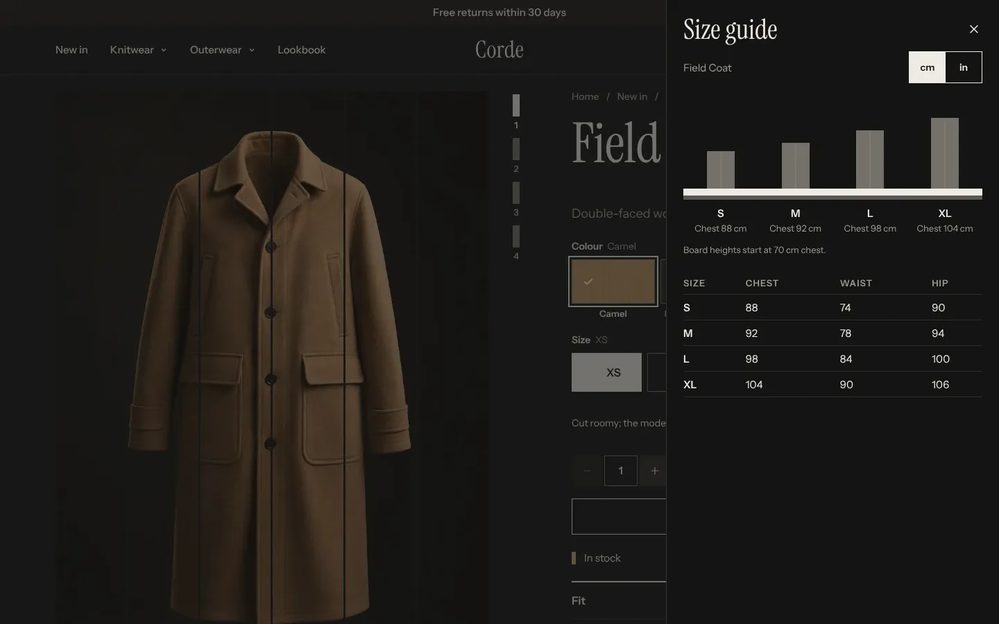
The fit line reads “M fits chest 92 cm.” for the chosen size, followed by your Fit note. Turn off Show fit line to hide both. The size buttons in the variant picker also get a small board, sized by each size’s chest.
The size guide is a block in the product template, so every product on that template shows the same measurements. Products that don’t have the option named in Size option name don’t show it. For a different chart, create another product template and assign it to those products. Shopify explains templates.
Fill the details accordion
Section titled “Fill the details accordion”Details is an accordion. Each Detail block inside it is one row with a Heading that opens its content. The default template has three rows. Description is open when the page loads. Care starts empty, so it stays hidden until you fill it. Shipping and returns holds placeholder text to replace.
- Write the row in Text, or connect Text to a product metafield so each product shows its own care notes or materials.
- To show the same page on every product, such as your returns policy, leave Text empty and choose a Page. The row shows that page’s content.
- Turn on Show open to have the row open when the page loads.
A row with no text and no page doesn’t show in your store. It stays visible in the theme editor so you can fill it.
Sell subscriptions
Section titled “Sell subscriptions”The Purchase options block shows “One-time purchase” and “Subscribe” as two choices, with the saving of the selected plan, and a delivery menu listing the product’s plans. If a product can only be bought on a subscription, “One-time purchase” is left out. Products with no plans don’t show the block.
Tambour doesn’t create the plans. Install a subscriptions app, which adds them to your products. Shopify explains subscriptions.
Show pickup availability
Section titled “Show pickup availability”The Pickup availability block shows “Pickup available at” your first pickup location and the usual time an order is ready there. With more than one location, “Check other stores” lists them all. It updates when the shopper picks another variant, and shows nothing for a variant no location offers for pickup. You turn on pickup per location in Shopify: set up local pickup.
Recommend products under the page
Section titled “Recommend products under the page”Pairs well shows a row of products picked by Shopify. With Recommendations set to Complementary, it shows the products you chose for this one in the Search & Discovery app, and falls back to related products when there are none. Related shows related products only. Products to show sets 2 to 8. When Shopify returns nothing, the section hides, heading included. Shopify explains how to set complementary products.
Recently viewed shows up to 8 products the shopper looked at before this one, newest first. The list is kept in the shopper’s browser, and the product being viewed is left out, so the section stays hidden on the first product a shopper opens.
Both sections can only be added to product templates.
Common questions
Section titled “Common questions”Can I show product reviews?
Section titled “Can I show product reviews?”Yes, with a reviews app. The product page has no reviews of its own. Add the app’s block to the Product section from Add block. When the app also fills Shopify’s standard rating fields, product cards show the stars and a line such as “4.8 out of 5, 312 reviews”. The Reviews section shows quotes you type in, plus the average rating of the product you choose in Product for the summary. It doesn’t pull reviews from an app.
Why does the fit line show only my fit note?
Section titled “Why does the fit line show only my fit note?”The chosen size has no Size block, or its Size name doesn’t match the option value. “M” and “Medium” are different values. Add a Size block for every value of the option.
Why don’t my swatches show colors?
Section titled “Why don’t my swatches show colors?”The option isn’t linked to a category metafield in Shopify, so its values have no swatch. Typing color names as option values gives plain buttons.
Why is the size guide missing on some products?
Section titled “Why is the size guide missing on some products?”Those products don’t have an option named as in Size option name. A common mistake is “Size” in the block and “Sizes” on the product.