Shelves, louvers and boards
Tambour builds its pages from upright slats in three forms. Spines stand for collections on a shelf, louvers turn open over a photo, and boards count something in your shop, such as products, minutes of reading or what is left on a gift card. You don’t draw any of them by hand: they follow your collections, products and settings.
Where spines appear
Section titled “Where spines appear”A spine is a collection standing on a shelf, with its photo, its name and its product count. Its height follows its product count against the largest collection on the same shelf. On the Collection list and All collections shelves the shortest spine still stands at 60% of the tallest, so a collection with 3 products stays readable next to one with 300. The count is the collection’s whole product count, whatever filters a shopper has on.
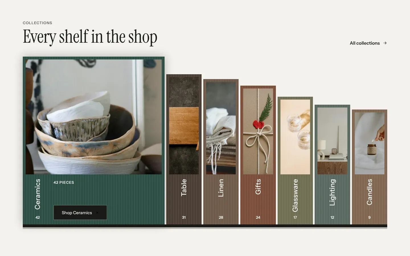
These sections and places print collection spines:
- The Collection list section, one spine per Collection block. The first spine stands open, with its count and a button such as “Shop Ceramics”.
- The All collections page, with your collections sorted by Sort.
- The Featured collection section with Layout set to Spine tabs. Up to five collections stand as spines, and choosing one shows up to three of its products.
- The header’s menu panel with Menu style on desktop set to Shelf of collections, and the phone menu with Drawer style set to Collection bars. Header and menus covers both.
- The Footer with Layout set to Closing shelf, from its Collections setting.
- The empty cart. The Cart drawer section shows the collections in Empty cart collections, or your seven largest when that is empty. The cart page always shows your seven largest.
- The Page not found section, from Collections on the shelf.
- The search panel before a shopper types, and the search page when nothing is found. See Search.
On phones narrower than 750px, the shelves on the page not found and search pages lie down as bars, each as long as its share of the largest collection.
Three sections stand other things as spines. In the Newsletter section with Layout set to Shelf of past issues, each article of the blog in Past issues from is a spine as tall as the article is long. In Reviews, each quote’s spine is as tall as the quote is long against the longest one. Press spines all stand at one height.
Choose the spine colors
Section titled “Choose the spine colors”Open Theme settings > Spines. Spine color 1 to Spine color 7 color the spines, and Spine text colors the name and count on all seven.
A collection takes its color from its place among all your collections by product count. Your largest collection wears Spine color 1, the second largest Spine color 2, and the eighth largest starts again at Spine color 1. Because the order is shop-wide, a collection wears the same color in the menu, on the home page shelf, in its banner and in the footer. The ranking reads your first 50 collections. In a shop with more, a collection past the 50th can wear a different color on different shelves.
Newsletter issues, reviews and the Steps boards take the seven colors in the order they stand. A publication in Press uses its own Spine color, or a tint of the text color when that is empty.
Spine text sits on all seven colors. Check that it reads on each one at a contrast of 4.5:1 or more. A light text color fails on a pale spine color.
Change the count word
Section titled “Change the count word”Count word is printed after a collection count, as in “42 products”. Count word for one is printed after a count of one, as in “1 product”. Both are in Theme settings > Spines, and they change the collection counts on the spines, the collection banner, the menus and the search panel. The Tambour preset uses “pieces” and “piece”.
A common mistake is changing Count word and leaving Count word for one as it is. The shop then shows “42 pieces” next to “1 product”. Change both.
Turn louvers on or off
Section titled “Turn louvers on or off”Louvers are slats over a photo that rest half open and turn open to show it. Theme settings > Animations > Open louvers as sections scroll into view is on by default. It controls these photos:
- Image with text with Photo style set to Louvers.
- The banner of a Collection page with Banner set to Photo.
- An Article with Layout set to Large lead photo, when the article has an image.
- The first look of a Lookbook.
With the setting on, the louvers turn open once 60% of the section is on screen, or once a section taller than the screen fills 60% of it. A section the shopper scrolls past before that shows already open, with no turn. With the setting off, these louvers are drawn open from the start.
Other louvers turn on their own cue, and this setting leaves them alone. Slideshow slides change on louvers. A Video opens its louvers when the shopper presses play or a background loop starts, or on the shopper’s first page view of a visit with Open louvers on the first page view. Later looks of a lookbook turn when the shopper picks them. An Image banner with Photo style set to Louvers never turns: it draws the photo as boards with seams between them, and moves the photo so your focal point, if you set one, sits in the middle of a board rather than on a seam.
If a shopper’s device is set to reduce motion, every louver is drawn open, whatever the setting. The slideshow changes slides with a fade and does not play on its own.
What sizes the boards
Section titled “What sizes the boards”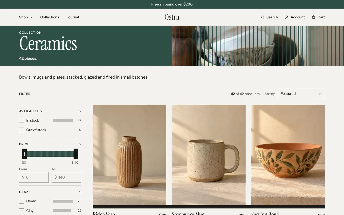
| Where | What the boards show |
|---|---|
| Collection page with Banner set to Boards over photo | One board per product. Past 60 products, one board stands for 2, 5, 10, 20, 50 or 100 products, and a line under the count says how many. A collection with no products shows no boards. |
| Under the products on a collection page | A meter with one slat per product, grouped the same way, filled up to the products shown. |
| Cart drawer, cart notification and cart page | Ten slats, each a tenth of Free shipping threshold in Theme settings > Cart. Set it to 0 to hide them. |
| Gift card page | Ten slats, each a tenth of the card’s starting value, filled for what is left. |
| Filters | A bar beside each filter value, as long as its product count against the largest value. |
| Variant picker block on the Product page | A board on each option button when every value of the option holds a number and a unit, such as 15 ml, as tall as its number against the largest. With a Size guide block in the same section, the boards follow each size’s Chest instead. |
| Size guide block on the product page | One board per Size block inside it, as tall as its Chest. |
| Visit the shop | One slat per day, as tall as that day’s opening hours against the longest day. |
| Blog with Layout set to Grid | One small board per minute of reading time, at 200 words a minute. |
Common questions
Section titled “Common questions”Why did a collection’s spine change color?
Section titled “Why did a collection’s spine change color?”Its place by product count changed. If it overtakes another collection, it takes that collection’s color, on every surface at once.
Can I give one collection a fixed color?
Section titled “Can I give one collection a fixed color?”No. The color follows the collection’s place by product count. You can change what each of the seven colors is.
Why are the louvers on my page already open?
Section titled “Why are the louvers on my page already open?”The shopper’s device asks for reduced motion, Open louvers as sections scroll into view is off, or the page loaded with the section already scrolled past.
Why does the boards banner show fewer boards than products?
Section titled “Why does the boards banner show fewer boards than products?”The collection has more than 60 products, so each board stands for a group. The line under the count says how many products one board is.