Header and menus
Tambour’s header reads one menu, the one in Main menu, and shows it two ways: as a row of links with panels on desktop, and as a drawer behind the Menu button on phones. You build the menu itself in your Shopify admin under Menus. Shopify lets a menu nest three levels deep. See Shopify’s guide to menus and links.
The header settings are on the Header section, in the Header group of the theme editor.
Pick a header layout
Section titled “Pick a header layout”Layout has four options:
- Logo center, menu left puts the menu on the left, the logo in the middle, and Search, Account and Cart on the right. This is the default.
- Logo left, menu inline puts the logo first, with the menu beside it.
- Two rows puts the logo row on top and the menu in a second row under it, centered.
- Menu button hides the menu row on desktop as well, so every screen size uses the drawer.
Phones narrower than 750px always show the drawer: Menu and Search on the left, the logo in the middle, Account and Cart on the right.
A common mistake is choosing Menu button and then changing Menu style on desktop or adding menu images. That layout never shows the desktop menu, so only Drawer style applies. The same layout also has no room for a search field: with Search style set to Field, it shows Icon and label instead.
Choose the desktop menu style
Section titled “Choose the desktop menu style”A top-level link with links under it opens a panel. Menu style on desktop decides what the panel looks like.
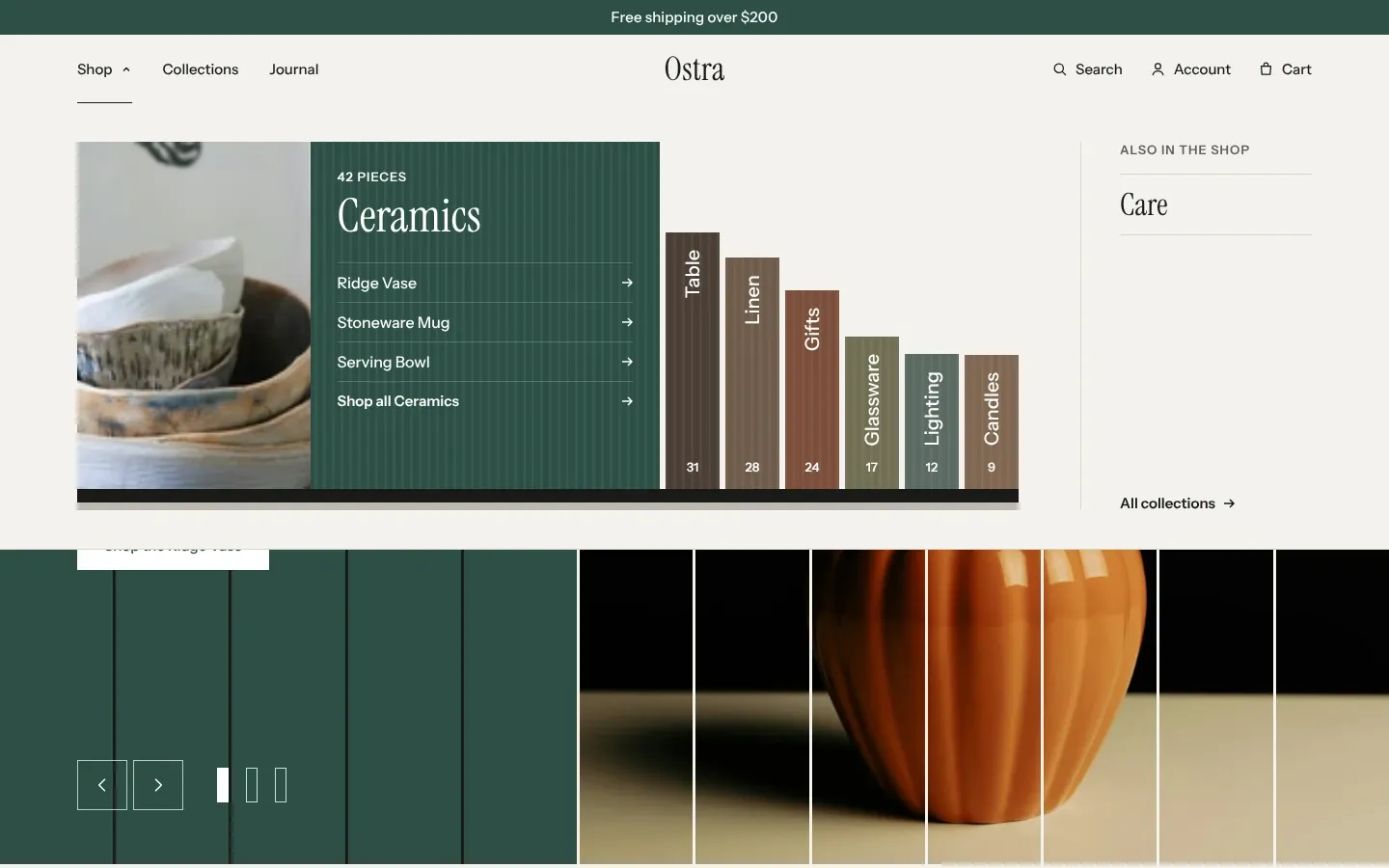
Shelf of collections is the default. A link with collections under it opens a shelf of spines, one per collection, each as tall as its product count. The first spine stands open with its photo, its count and its own links underneath. The spine under the pointer opens in its place. The shelf holds 11 spines. A link with more collections than that gets an “All collections” spine at the end. Links under it that are not collections, such as pages or products, are listed beside the shelf under “Also in the shop”. A top-level link with no collections under it opens a plain dropdown instead.
Columns with image shows each second-level link as a column with its own links under it. A collection link carries a bar as long as its product count against the others in its column. If none of the second-level links has links of its own, the panel is one column under the top-level link’s title. Add a menu image to fill the right of the panel; see the next heading.
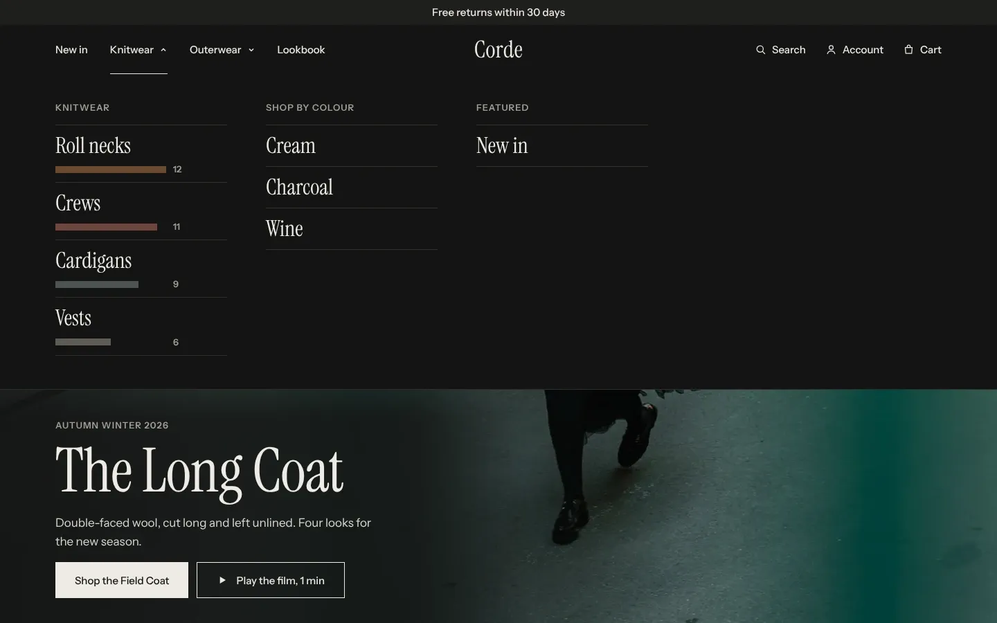
Dropdown shows a list under the link. A second-level link with its own links opens the third level beside the list.
In every style, a top-level link with links under it opens its panel and does not go to a page itself. The dropdown ends with a “Shop all” row for that link’s page, such as “Shop all Knitwear”, unless a link under it already goes there. On the shelf, each open spine has its own “Shop all” row, and in columns each column title links to its page. Panels open on a click, or when the pointer rests on the link for a moment.
If the menu is wider than the bar, the links that do not fit move into a “More” dropdown at the end, last link first.
Add a menu image
Section titled “Add a menu image”Menu images show only with Menu style on desktop set to Columns with image.
- In the theme editor, select the Header section.
- Click Add block and choose Menu image.
- In Menu item, type the title of the top-level link whose panel shows the image, such as “Knitwear”.
- Choose an Image, and add a Caption and a Link if you want them.
- Click Save.
A common mistake is a Menu item that doesn’t match any top-level link. Capitals and spaces at the ends don’t matter, but the words must be the same as the link’s title in your menu. A link under a top-level link can’t hold an image.
Choose the drawer style
Section titled “Choose the drawer style”Drawer style sets how the drawer lists the menu.
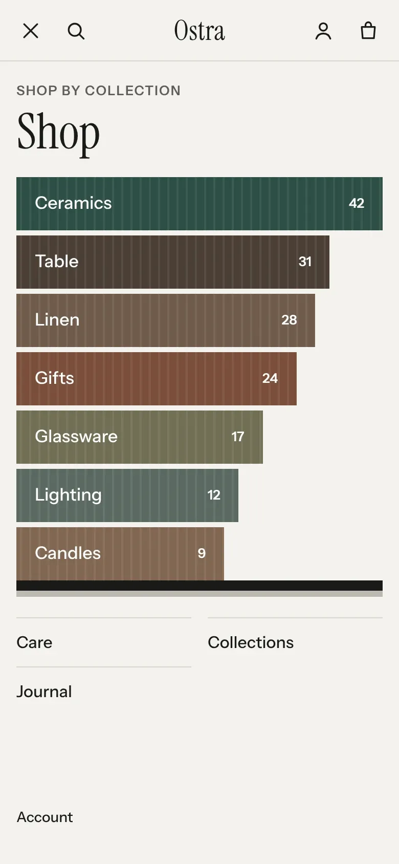
Collection bars, the default, takes the first top-level link that has collections under it and lists those collections as bars, each as long as its product count, under “Shop by collection” and the link’s title. The other links follow as a plain list. A link with links under it opens a submenu over the drawer, with Back to return.
List shows every top-level link as a large row. A link to a collection or to all products carries a thin bar for its product count. A row with links under it opens a submenu, and a row in that submenu opens the third level.
Account, and the country and language selectors when they are on, sit at the foot of the drawer.
Show or hide product counts
Section titled “Show or hide product counts”Show product counts prints the number of products beside each collection in the menus and the drawer. Turning it off hides the numbers only. Spine heights and bar lengths still follow the counts, because they come from the same numbers. The counts are each collection’s whole product count.
Menu color scheme colors the desktop menu panels. The drawer uses the header’s own Color scheme.
Set the account menu
Section titled “Set the account menu”When customer accounts are on in your Shopify admin, the header shows Account. Customer account menu picks the menu shown when a signed-in customer opens it. Shopify draws that menu, not the theme. See Shopify’s guide to customer accounts.
Make the header sticky or transparent
Section titled “Make the header sticky or transparent”Sticky header has three options:
- None lets the header scroll away with the page.
- Always keeps the header at the top. On desktop it shrinks to a slimmer bar once the page scrolls.
- On scroll up, the default, hides the header while the shopper scrolls down and brings it back when they scroll up past the first screen. On desktop it comes back as the slimmer bar. With the Two rows layout on desktop, the logo row stays and only the menu row turns away while the shopper scrolls down.
Show over first section on home page lays the header over the first section of your home page, such as a slideshow, with a shade at the top so the links read. It works on the home page only; every other page shows the solid header. Color scheme over first section sets the colors while the header sits over the photo. Pick a scheme whose text reads on your photo. The header turns solid in its own Color scheme once the page scrolls or a menu panel opens.
Set up the announcement bar
Section titled “Set up the announcement bar”The Announcement bar sits above the header and holds up to six Message blocks. Layout has three options:
- Single message shows the first message.
- Turning messages turns from one message to the next every Seconds between messages. It pauses while the pointer or keyboard focus is on the bar, and the shopper can pause it with the button at the end. With fewer than two messages it shows a single message. If a shopper’s device asks for reduced motion, the messages don’t turn.
- Message with links shows the first message with a Menu on the left, from 750px wide, and your social links on the right from Theme settings > Social media.
Each message has its own Text, Link and Color scheme. Keep a message to 8 words. A longer one ends in an ellipsis on desktop and wraps to two lines on phones.
A common mistake is clearing the first message’s Text to hide one message. The bar checks the first message, so with that empty the whole bar disappears. Delete or hide the block instead.
Set up the footer menus
Section titled “Set up the footer menus”The Footer holds up to three Menu blocks, each showing one menu from your Shopify admin. The column heading is the menu’s title, so rename the menu in your admin to change it. Each column lists the menu’s top-level links only; links nested under them don’t show. On phones the columns fold into rows, with the first one open.
The footer’s Layout decides what stands with the menus. Closing shelf adds a shelf of spines from its Collections setting and a newsletter signup. Columns with newsletter puts the signup beside the menus. Compact has no signup and leaves out Text. The footer’s spines hide on the page not found, which shows its own shelf.
Common questions
Section titled “Common questions”Why don’t my third-level links show in the phone menu?
Section titled “Why don’t my third-level links show in the phone menu?”With Drawer style set to Collection bars, only the links under the first top-level link that holds collections open a third level. Under any other top-level link, the drawer stops at the second level. Set Drawer style to List to show all three levels.
Why does my menu open a dropdown and not the shelf?
Section titled “Why does my menu open a dropdown and not the shelf?”The shelf needs links to collections directly under the top-level link. A top-level link whose links all go to pages, products or other addresses opens a dropdown.
Why is my menu image not showing?
Section titled “Why is my menu image not showing?”Check two things: Menu style on desktop is set to Columns with image, and Menu item matches the top-level link’s title.
Can a menu go four levels deep?
Section titled “Can a menu go four levels deep?”No. Shopify menus stop at three levels.