Filters and sorting
Collection pages and search results in Pawsome share one filtering system. Shopify decides which filters exist and which values they offer. The theme decides how they look and behave. You set the first in the Search & Discovery app and the second in the theme editor.
Create the filters in Search & Discovery
Section titled “Create the filters in Search & Discovery”Pawsome shows the filters that the free Shopify Search & Discovery app provides. The theme has no filter list of its own, so with no filters set up in the app, no filters show on the storefront.
- Install the Search & Discovery app from the Shopify App Store if your store does not have it yet.
- In Shopify admin, go to Apps > Search & Discovery > Filters.
- Click Add filter, pick a source such as availability, price, product type, vendor, tags, a product option or a metafield, then click Save.
- Repeat for each filter. The order in the app is the order on the storefront.
Shopify sets the limits. A store can have up to 25 filters, a filter shows at most 100 values, and a collection with more than 5,000 products shows no filters. A filter only lists values that match products in the collection or search being viewed. Read Shopify’s guide to Search & Discovery filters for the details.
How each filter type looks
Section titled “How each filter type looks”- List filters show a checkbox for each value. After eight values, the rest fold under a Show more link.
- Swatch filters show a round color swatch next to each value, and image filters a small square image. You get these by setting a filter’s visual display to swatches or images in Search & Discovery, which needs a metaobject with a color or image field.
- The price filter shows two number fields, a minimum and a maximum, in the currency the shopper is browsing in. The results update half a second after the shopper stops typing. If the minimum is higher than the maximum, the theme swaps them.
A value with no matching products is grayed out and can’t be selected, unless it is already applied. That way a shopper can always clear a filter they chose.
Turn filtering on
Section titled “Turn filtering on”Filtering lives in two sections: Collection on the collection template and Search results on the search template. Both have the same Browse settings.
- Go to Online Store > Themes > Customize.
- Open a collection page from the page selector at the top of the editor, then select the Collection section.
- Check that Enable filtering is on. It is on by default.
- Turn Show filter counts on to print the number of matching products after each value, or off for a cleaner list.
Repeat on the search template with the Search results section. The two sections keep separate settings, so collections can use a sidebar while search uses a drawer.
Choose a filter layout
Section titled “Choose a filter layout”Filter layout has three options. They differ on large screens, 1024 pixels wide and up. On anything narrower, all three put the filters behind a Filters button that opens a sheet from the bottom of the screen.
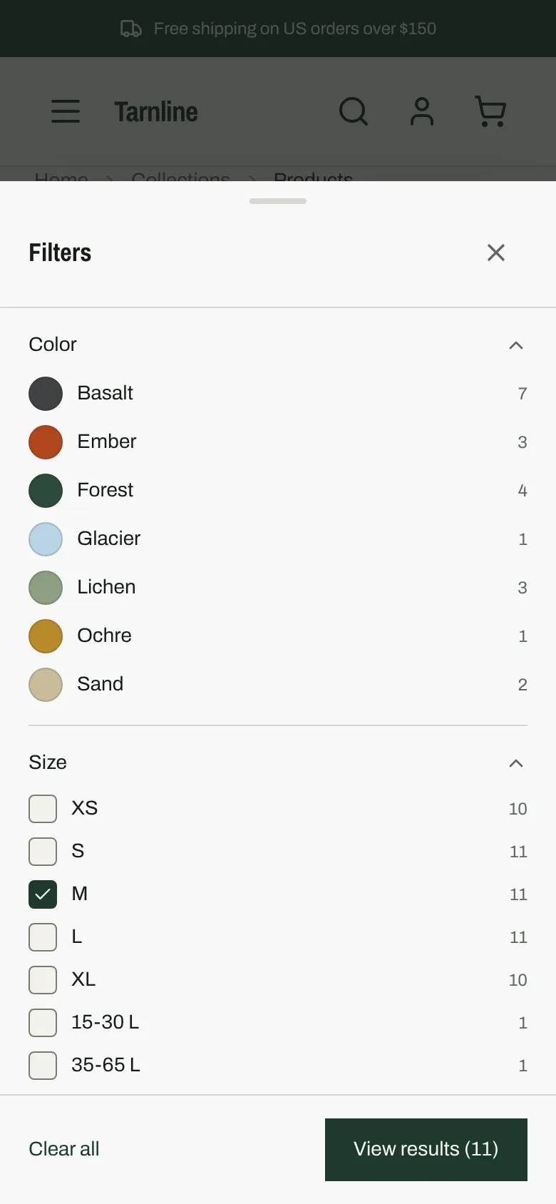
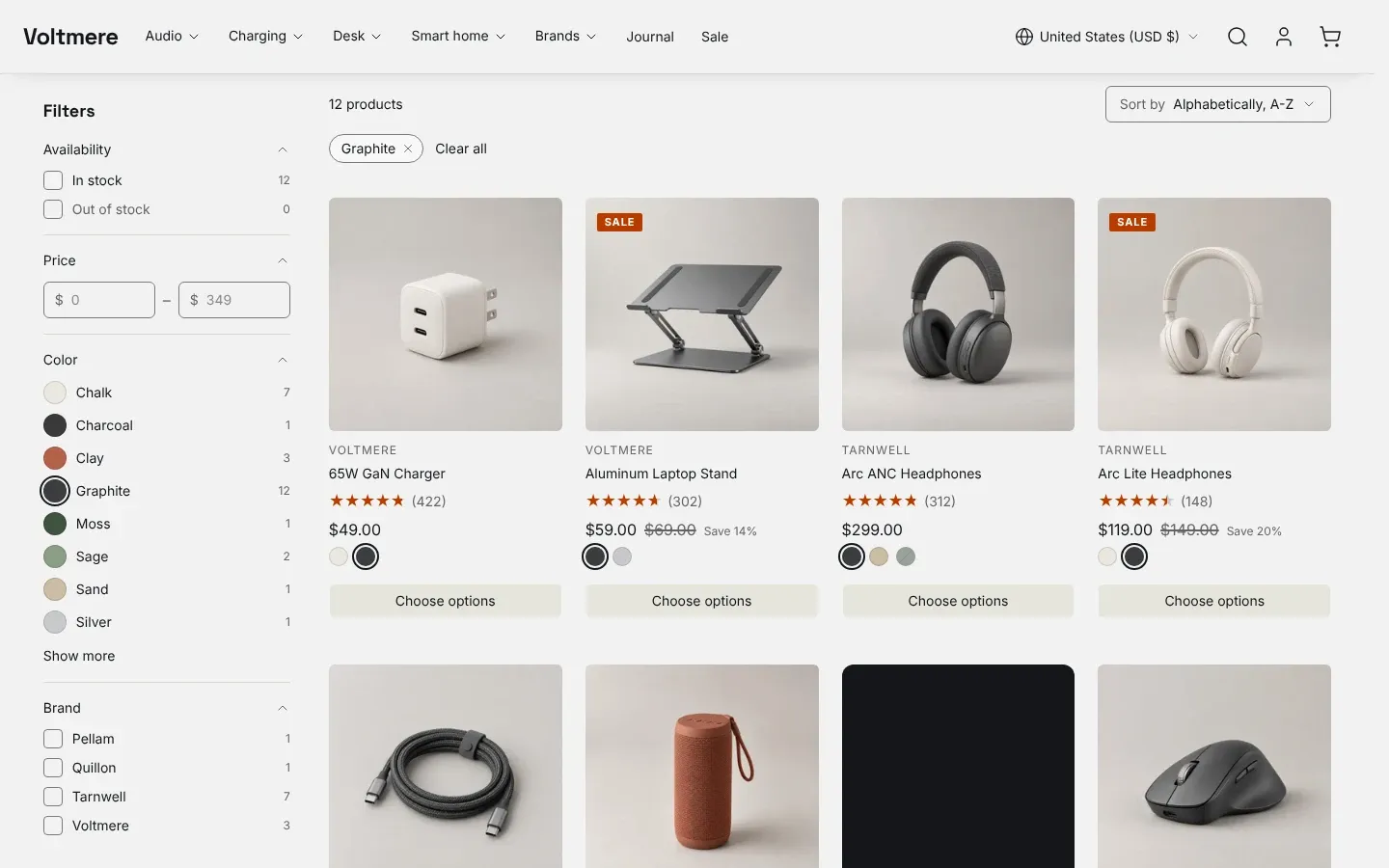
- Sidebar is the default. The filters sit in a column to the left of the product grid, with every group open. The column stays in view while the shopper scrolls.
- Horizontal bar puts one button per filter in the toolbar above the grid. Each button opens a small panel with that filter’s values and shows how many values are applied. The product grid keeps the full page width.
- Drawer hides the filters behind a Filters button at every screen size. On large screens the drawer slides in from the left.
The drawer and the phone sheet end with a Clear all link and a View results button that shows the live result count. Results update as soon as a shopper selects a value, with no apply step. The panel stays open while the grid reloads behind it.
On phones and tablets, a floating Filters button appears at the bottom of the screen once the shopper scrolls past the toolbar, so they can refine without scrolling back up.
Applied filters show as chips under the toolbar, with a Clear all link. Each chip removes one value.
Sorting
Section titled “Sorting”Enable sorting adds a Sort by menu to the toolbar. Shopify supplies the options in it, and collections and search get different lists. You cannot add, remove or rename them in the theme. If Shopify offers only one option, the menu does not show.
- The menu keeps the applied filters when the shopper changes the order.
- On screens under 1024 pixels, when filtering is on, the sort options move into the filter sheet, and the floating button reads Filter and sort.
Each collection opens in its own default order. To change it, go to Products > Collections in Shopify admin, open the collection, and pick an order from Default sort. See Shopify’s guide to collection sort order.
Product count
Section titled “Product count”Show product count prints “24 products” or “24 results” at the start of the toolbar. With it off, the count is hidden on screen but screen readers still announce it after each filter change.
Products per page and pagination
Section titled “Products per page and pagination”- Products per page on the Collection section runs from 8 to 48, in steps of 4. The default is 24.
- Results per page on the Search results section runs from 8 to 50, in steps of 2. The default is 24. Search pages mix products, articles and pages, so this count covers all three.
Pagination sets how shoppers reach the next page:
- Numbered shows previous, next and page number links under the grid. Each page has its own URL.
- Load more button shows “Showing 24 of 120” and a Load more button. Each press adds the next page of products under the ones already shown.
- Infinite scroll loads the next page when the shopper nears the end of the grid. The Load more button stays under the grid as a fallback.
With load more and infinite scroll, the page URL updates to the last page loaded. If a shopper reloads, they land on that page, not on a longer list.
Promotion tiles in the grid
Section titled “Promotion tiles in the grid”The Collection section accepts Promotion blocks: image, video, collection or text tiles placed between product cards. Position places a tile before the product at that position, counted across pages. A tile at position 30 with 24 products per page shows on page two. With filters applied, the tile keeps its position in the filtered list. See the Collection section reference for every block setting.
Empty results
Section titled “Empty results”The theme shows a different message for each empty state.
- A collection with no products says the collection is empty and links to all products.
- On a collection, filters that match nothing say no products match and offer a Clear all filters button.
- A search with no results, with or without filters, names the search term, lists your suggested searches as links, then shows products from a collection you pick.
To set up that last one:
- In the Search results section, pick a collection under Collection to show when there are no results. The theme shows as many of its products as the Columns setting, one row on large screens.
- In Theme settings > Search, fill in Suggested searches with comma-separated terms, such as New arrivals, Gifts, Sale. The same terms show on the search page before a shopper types anything.