Navigation and mega menus
Pawsome does not store menus itself. You build them in the Shopify admin, then pick them in the theme editor. The header uses one menu for both the desktop navigation and the mobile menu. Each footer column shows one menu of its own.
Build a menu in Shopify
Section titled “Build a menu in Shopify”- From your Shopify admin, go to Content > Menus.
- Click the menu you want to edit, for example Main menu.
- Click Add menu item, enter a name, choose a link, and click Add.
- To nest an item, drag it by its handle under the item that should hold it.
- Click Save menu.
Shopify lets a top-level item hold two nested levels, so a menu has three levels at most. Pawsome’s header shows all three. Shopify’s guides cover editing menus and drop-down menus.
Connect the menu to the header
Section titled “Connect the menu to the header”- Go to Online Store > Themes > Customize.
- Click Header in the sidebar.
- Under Menu, choose your menu. The default is Main menu.
To add a small pill to a link, end its name in the Shopify admin with a word in square brackets, for example Sale [Hot]. The header and the mobile menu show “Sale” with a “Hot” pill, and so do the footer’s Menu column blocks.
The Header reference lists every setting.
How the header shows each item
Section titled “How the header shows each item”The desktop navigation shows on screens 1024 pixels wide and up. The header picks a style for each top-level item from what the item holds:
- An item with no sub-items is a plain link.
- An item with sub-items but no third level opens a dropdown list.
- An item with a third level anywhere under it opens a mega menu. Each second-level item that has its own links becomes a column, with its name as the column heading. Second-level items without links of their own gather into one extra column.
A mega menu block also turns an item into a mega menu, even when its sub-items stop at the second level.
Clicking a top-level item that has sub-items only opens its panel. When that item links somewhere, the panel starts with a View all link to it. With a mouse, panels open on hover as well as on click.
These header settings change how the navigation behaves:
- Collapse extra links into “More” keeps the navigation on one line. Links that don’t fit move into a More menu along with their sub-links.
- Mega menu style chooses Floating card or Full-width band.
- Dim the page behind mega menus darkens the page while a mega menu is open.
- Layout set to Navigation split around logo puts the first half of your top-level items before the logo and the rest after it.
Add a mega menu block
Section titled “Add a mega menu block”A mega menu block adds up to three promotion cards and one collection card beside the link columns of one top-level item. Add one block for each item that should get cards.
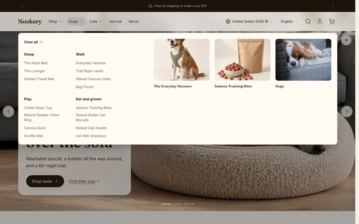
- In the theme editor, click Header, then click Add block and choose Mega menu.
- In Menu item, type the title of a top-level item from your menu, for example
Dogs. - Under Promotion 1, Promotion 2 and Promotion 3, add an Image, a Heading, and a Link. A promotion shows once it has an image or a heading. The link is optional.
- Under Collection card, pick a Collection. Its card uses the collection’s image and title, links to the collection, and comes after the promotions.
- Choose a Card layout: Grid, Mosaic or Carousel.
The block matches Menu item to the menu’s top-level titles without regard to capitals or spaces at either end, and it ignores a [Badge] suffix on the menu title. Leave the badge out of the block’s Menu item too. When two blocks name the same item, only the first one shows. In the theme editor, a block that matches nothing, or names an item another block already uses, shows a note under the header asking for a top-level title.
If you translate your menu, give the block’s Menu item the same translated title. The block compares against the title in the shopper’s language, so an untranslated block does not match a translated menu item.
Mosaic needs at least three cards. With fewer it shows as a grid, and a single card always shows as a grid. When the link columns need the room, the cards switch to a carousel on their own.
See Mega menu for the block’s full settings.
Set up the mobile menu
Section titled “Set up the mobile menu”Below 1024 pixels, the header shows a menu button that opens a drawer with the same menu. The drawer also shows all three levels.
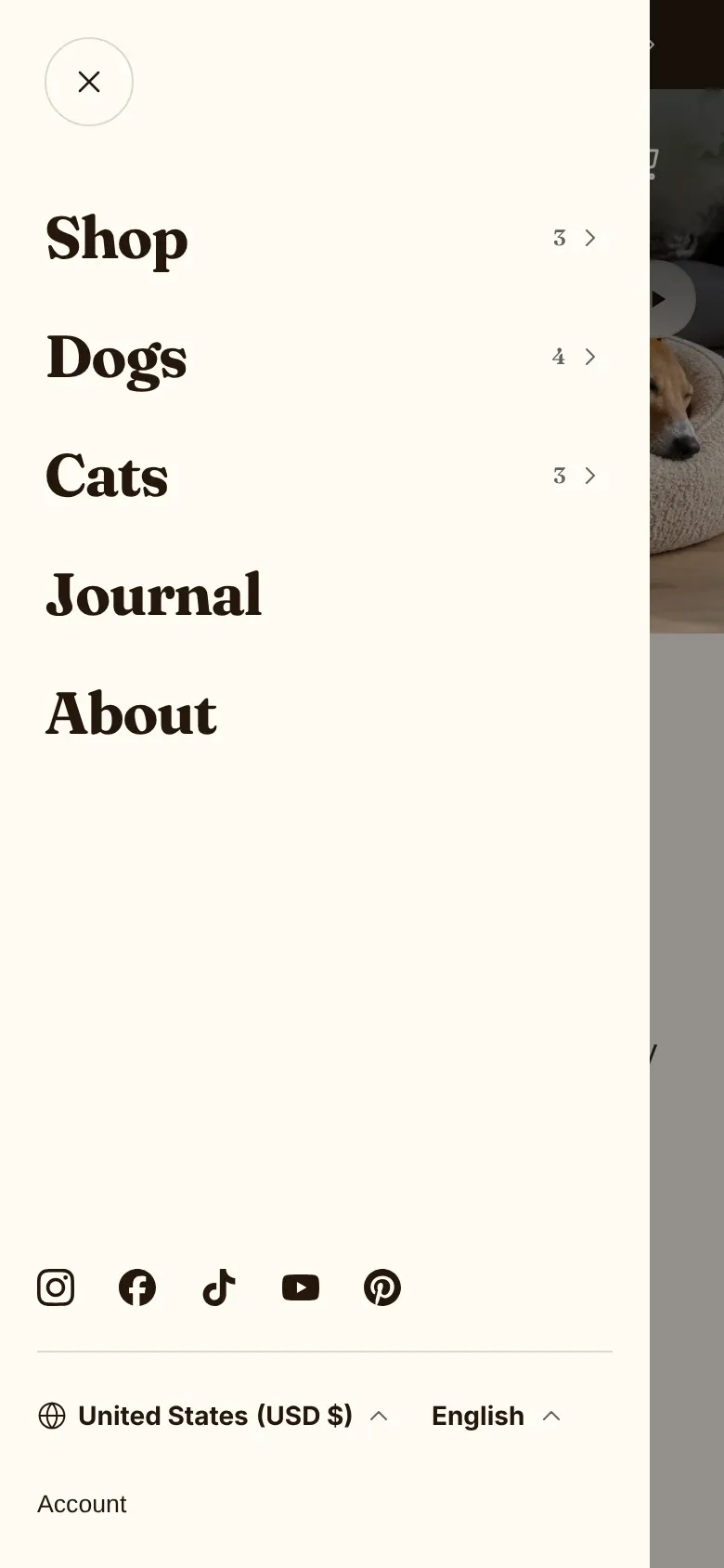
- Mobile menu levels chooses Sliding panels, where each level slides over the one before, or Accordion, where levels expand in place.
- Mobile menu style offers Standard or Editorial, which shows larger links. It appears only with Sliding panels.
- Show link images in the mobile menu adds a small image beside second- and third-level links. It works with Sliding panels only. The image comes from the linked collection, product, blog or article. Other links show the first letter of their name.
- Mobile menu side sets which edge the drawer slides in from.
A mega menu block’s cards also appear under its item in the mobile menu. Turn off Show in the mobile menu on the block to keep them on desktop only.
The bottom of the drawer shows your social media links from Theme settings > Social media, the country and language selectors when they’re on in the header, the account link, and any Header action links.
Announcement bar
Section titled “Announcement bar”The announcement bar sits above the header in the header group. It holds up to five Message blocks.
- In the theme editor, click Announcement bar.
- Edit each message’s Text, and add an Icon if you want one.
- Choose a Display. Rotate one at a time shows one message after another. Scroll continuously runs all messages in a moving line.
How links work depends on the display. With Rotate one at a time, each message has its own Message link. With Scroll continuously, the Bar link links the whole bar. A message whose text already contains a link keeps that link. With Rotate one at a time, that message ignores its Message link. With Scroll continuously, one such message turns off the Bar link for the whole bar.
Show close button lets shoppers hide the bar for the rest of their session. Show on home page only hides it on every other page. The Announcement bar reference lists every setting.
Footer menus
Section titled “Footer menus”The footer shows menus through Menu column blocks, one menu per block.
- Create the menu in Content > Menus. Shopify stores come with a Footer menu.
- In the theme editor, click Footer, then add a Menu column block.
- Choose its Menu, and add a Heading if you want one.
A footer column shows only the menu’s top-level items. Nested items do not appear, so build footer menus flat. On small screens, a column with a heading collapses into an accordion that starts open. See Menu column for its settings.