Product pages
Every product uses the default product template unless you assign it another one. The template starts with Product, which holds the media gallery and the product information. Below it, every preset adds Related products and Recently viewed, and the Pawsome and Siesta presets add Text with icons too.
To edit it, go to Online Store > Themes > Customize, then choose Products > Default product from the page menu at the top of the editor.
Blocks you can add
Section titled “Blocks you can add”The Product section holds blocks in a column beside the gallery. Add, remove and drag them into the order you want. The product blocks are:
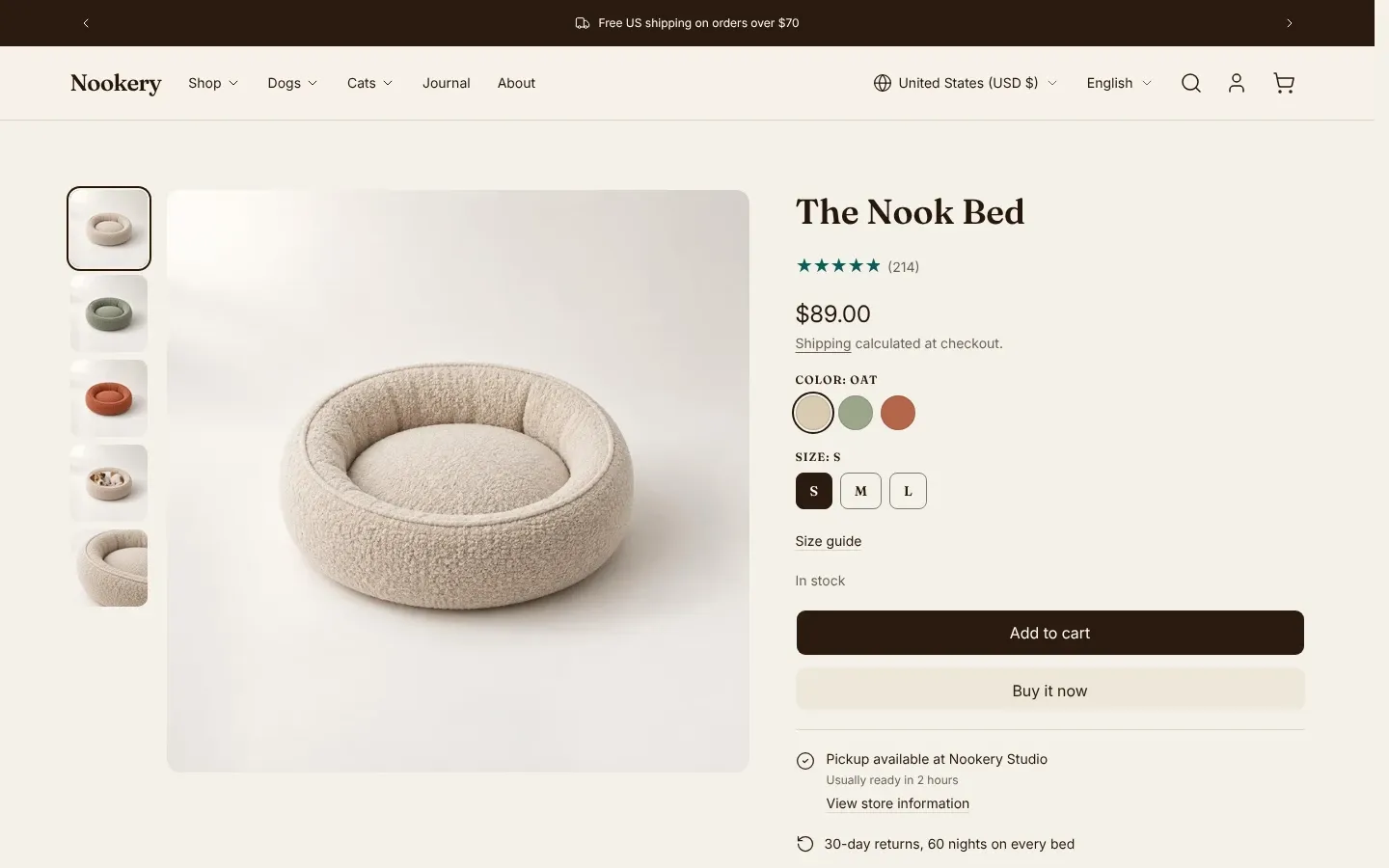
- Product title, Product vendor, Product SKU, Product price and Product rating
- Variant picker, Quantity selector and Buy buttons
- Inventory status, Pickup availability and Volume pricing
- Product description, Collapsible row, Product disclosures and Size chart
- Sales point, Complementary products and Share
The section also accepts Heading, Text, Button, Button group, Image, Icon, Caption, Stats, Custom Liquid and app blocks. The Product reference lists the section’s settings.
Media gallery
Section titled “Media gallery”The gallery shows the images, videos and 3D models you add to the product in the Shopify admin. Shopify’s guide to product media covers uploading them.
Pick a Gallery layout in the Product section:
- Thumbnails below and Vertical thumbnails show one item at a time with a strip of thumbnails. Vertical thumbnails puts the strip beside the media on wide screens. On phones, both swap the strip for dots.
- Carousel shows one item at a time with dots and no thumbnails.
Where the gallery shows dots, a product with more than ten media items shows a count instead, such as 3 / 26.
- Stacked shows every item in one column. Grid shows them in two columns, with the first item full width.
On smaller screens, Stacked and Grid turn into a row that shoppers swipe through: Grid on phones, Stacked on phones and tablets.
Aspect ratio crops every item to one shape. Adapt to image keeps each item’s own shape; in the three one-at-a-time layouts, the frame takes the shape of the tallest item. Media position puts the gallery on the left or right, and Media width sets its share of the row, from 40% to 60%.
Clicking an image opens it full screen. Shoppers zoom up to four times with a pinch, a double tap or a double-click, and move between images with arrows. Zoom covers images only. Videos and 3D models play in place.
Video and 3D models
Section titled “Video and 3D models”Videos show their poster image with a play button and load when a shopper clicks it. Uploaded videos and YouTube or Vimeo links both work. A 3D model shows its poster with a View in 3D button. After a shopper opens the model, devices that support augmented reality also show a View in your space button.
Variant images
Section titled “Variant images”When a shopper picks a variant that has its own image, the gallery moves to that image. Turn on Show only the selected variant’s media to show that image plus the media not attached to any variant, and hide the other variants’ images. The Variants and swatches guide covers this in more detail.
Sticky elements
Section titled “Sticky elements”Enable sticky product information keeps the information column in view while shoppers scroll a long gallery on wide screens. With the thumbnail and carousel layouts, the gallery sticks too.
Show sticky add to cart bar is on by default. The bar slides up from the bottom of the screen once the main add to cart button scrolls out of view, and hides again past the end of the Product section. It shows the product title, the selected variant and price, and an add to cart button. The bar needs a Buy buttons block in the section.
Buy buttons
Section titled “Buy buttons”The Buy buttons block holds the add to cart button.
- Show dynamic checkout buttons adds Shopify’s accelerated checkout buttons under it. Which buttons show depends on your payment settings and the shopper’s device. See Shopify’s guide to accelerated checkout buttons.
- Layout set to Inline puts a quantity stepper, the add to cart button and the dynamic checkout buttons in one row. Show quantity in the row controls that stepper, which stays hidden when the section has a Quantity selector block.
- Products sold with subscriptions show purchase options above the button. The options come from your subscription app.
- Gift card products show a Send as a gift checkbox that opens fields for the recipient’s email, plus an optional name, message and send date.
Recommendations
Section titled “Recommendations”Complementary products
Section titled “Complementary products”The Complementary products block shows products that go with the one on the page, as compact rows with a quick add button. Turn off Stack products to show one product at a time with arrows. It shows only products you pick in Shopify’s Search & Discovery app. Shopify does not generate complementary products automatically.
- From your Shopify admin, go to Apps > Search & Discovery.
- Click Product recommendations, then Add recommendations.
- Choose a product and pick its complementary products.
- Save.
Shopify’s guide to product recommendations has the details. A product with no picks shows nothing on your store. The block shows up to four, set by Maximum products to show, which starts at two.
Related products
Section titled “Related products”The Related products section below the product uses Shopify’s automatic recommendations when Recommendation type is Related. A new store often has none yet. Set a Fallback collection to show that collection’s products until Shopify has recommendations. With no fallback, the section hides. See Related products.
Pickup availability
Section titled “Pickup availability”The Pickup availability block tells shoppers whether they can collect the selected variant from a store. It shows the first location Shopify lists, with its pickup time, and a link that opens a panel listing every pickup location.
The block needs local pickup turned on for at least one location. From your Shopify admin, go to Settings > Shipping and delivery > Pickup in store. See Shopify’s guide to local pickup.
The block hides when the selected variant is sold out or no location offers pickup. Show directions link and Show phone number control what each location shows in the panel.
Size chart
Section titled “Size chart”The Size chart block adds a link that opens a page’s content in a pop-up.
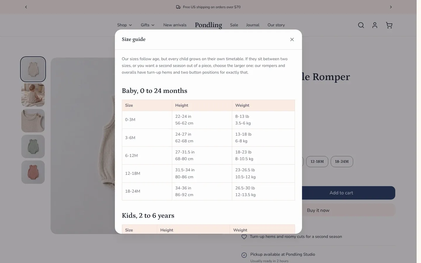
- From your Shopify admin, go to Online Store > Pages and create a page with your size chart. Shopify’s guide to adding pages covers this.
- In the theme editor, add a Size chart block and choose that page under Page.
- Optionally enter a Link label. It defaults to “Size chart”.
The pop-up’s heading is the Link label, or the page title when the label is blank. Without a page, the block shows nothing on your store.
Every product on a template shares the page you pick. To give each product its own chart, connect Page to a page metafield instead, as How do I add a size chart? explains.
Collapsible rows
Section titled “Collapsible rows”The Collapsible row block shows a heading that opens to reveal text. Fill it with Content, pick a Page, or both. Content can come from a product metafield through a dynamic source, so each product can show its own text. A row with neither content nor a page shows nothing on your store.
The Product description block can also show as a collapsible row: set Display to Collapsible.
Blocks that need Shopify data
Section titled “Blocks that need Shopify data”These blocks show only when Shopify has the data. In the theme editor they show sample content, so check them on your live store. Shopify data Pawsome reads lists every feature that depends on data in your admin.
- Product rating reads the standard review metafields that product review apps write. Without a review app, it shows nothing.
- Product disclosures shows the product’s entries from Shopify’s Disclosures metafield, such as safety warnings, as collapsible rows. An entry appears only when its display settings include product pages. Entries whose display settings include the cart also show in the cart, behind an info icon on the item. See Shopify’s guide to product disclosures.
- Volume pricing shows a table of quantities and prices when the product has quantity price breaks in the shopper’s B2B catalog. It updates when the shopper picks another variant. See Shopify’s guide to volume pricing.
- Product SKU hides when the selected variant has no SKU.
Sales points
Section titled “Sales points”A Sales point is one line of text with an Icon, such as free returns or a warranty. Add one block per point. A block with no Text shows nothing.
Inventory status
Section titled “Inventory status”The Inventory status block reads the selected variant’s real stock:
- When Shopify tracks the variant’s inventory and between 1 and Low stock threshold units are left, it shows a low stock message with the count.
- Otherwise, when the variant can be bought, it shows “In stock”. That includes variants without tracked inventory, and variants set to keep selling when out of stock.
- When the variant is sold out, it shows nothing.
Alternate product templates
Section titled “Alternate product templates”Use an alternate template when a group of products needs different blocks, such as a size chart for clothing only.
- In the theme editor, open the page menu at the top, go to Products, and click Create template.
- Name it and choose the template to copy, then click Create template.
- Change the blocks and sections in the new template.
- From your Shopify admin, go to Products, open a product, and choose the new template under Theme template. Click Save.
Shopify’s guide to templates covers assigning a template to many products at once.